Before you start marketing, it’s important to ask. Do you have a lead generating website design for your business?
When someone comes to your website with zero knowledge about your business and what you sell, what will they think? Will they be impressed? Want to learn more? Annoyed? Or not even get to see your site because it’s so slow?
In simple terms: is your website a good representation of your business and does it move your customers down your sales funnel?
So many business owners I speak with will tell me how they are embarrassed of their website. This always makes me so sad, because your website is the only thing on the internet that you actually own. It’s YOUR real estate (you rent from Pinterest, Instagram and Facebook), it’s the place where you control the message and what your customers see. It should be the best possible place to understand your business and buy from you.
There are two types of bad website in this world.
- The website that looks like crap, works like crap and is crappy to use.
- The website that looks fancy and beautiful, but works like crap.
You don’t want to be in either camp! Your e-commerce website should be dialed in, focused and above all, have a well thought out customer journey.
You might be asking, what does a good website have to do with Pinterest marketing?
Well, everything, actually. You can have the best Pinterest strategy in the world, but if people land on your website and immediately leave, then what’s the point? The goal of Pinterest is sending traffic to your website so that they will buy from you. Your website is half the equation! The goal is to take make your cold Pinterest traffic nice and hot by taking them through your greater marketing funnel. This is where your website comes in!

We spend a lot of time fine-tuning our client’s website funnel, so I decided to create a little checklist to help you master some of the common problems we see.
PS- need a web designer? Here’s who we recommend,
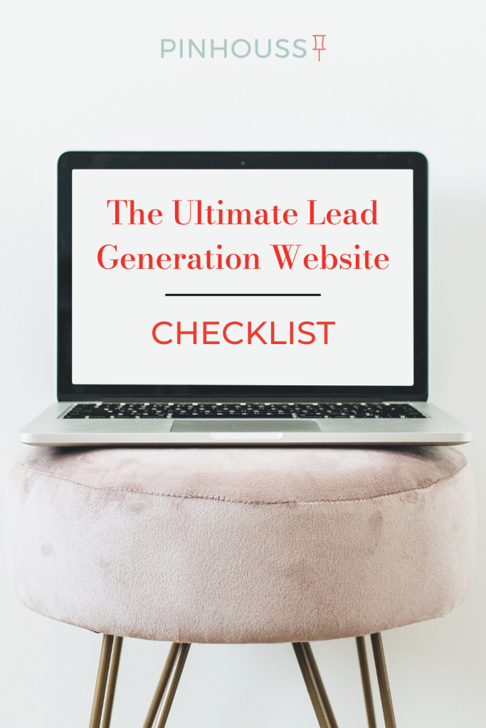
The Lead-Generating Website Checklist
1. CTA (call-to-action) On Every Page
Every single website visitor should understand what you do and sell from EVERY page of your website. This means if I enter your site from a blog post, I should be able to tell what you do and how I can learn more (your side bar and main menu is helpful here). From your home page to your product pages and everything in between; the goal of your website is to get people to stay and shop! Make it as easy as possible for them. Help them take the next step!
2. GREAT Product Photos
Your product photos and branding is usually someone’s first impression of your business, and we all know how important first impressions are! Think about it, if I get to your website and all I see are badly lit and blurry photos, am I going to trust your business enough to hand over my credit card information? Probably not. But if I see professional quality photos and a well designed site, I am more likely to think that your business is professional and trustworthy.
It’s an investment to have quality photography, but it will always pay in the end!

An example of a great ecommerce website from our client, rooapron.com
3. Incentive to Opt-In
Cold traffic can be difficult to convert the first time, so your goal should be to incentivize the new visitor to take the next step in your sales funnel. A few ideas might be offering a discount, a guide, ebook or freebie in exchange for their email address. Email marketing is one of the very best ways to grow your brand and nurture leads, so it’s worth developing a good strategy.
You can also incentivize them to follow you on social media through a pop-up. Social media can be a great help in building community around your business.
4. Mobile Optimized
85% Of users on Pinterest are on a mobile device, and this stat is true across the board when it comes to internet usage. Make sure your website is easily navigated on a mobile device. Function over form is a good way to think of this. You may need to make choices that simplify the design in the name of making your mobile site easier to navigate, but it will be worth it in the end!
5. “More Like This” here, there and everywhere!
One of my favorite things to do when I am shopping is to see the “More Products Like This” area on the product page. It helps me know what else I might like and do more research on what I am buying. Your website should have this on all product pages. You could also have a “Best Sellers” tab or area on your home page to further encourage clicking around. On your blog, I recommend adding a “More Posts Like This” at the bottom of every post (there are many plugins that will easily do this for you). Again, we are always thinking about how we can encourage a visitor to STAY!
6. Shoppable Blog Posts
A blog is a great way to introduce people to your business and generate traffic, but it also needs to be used as a clear tie to what you sell. Every post should be connected to your overall marketing strategy. If you sell products, then you should make sure I can easily buy the products from the post. And if it’s services, you could offer a freebie or opt-in at the bottom (like at the bottom of this page!) connected to an email sequence that helps people understand how you can serve them.
7. “Start Here” page
This is one of my favorite tips, create a page geared especially for the brand new visitor. This is a great thing to add to your blog side bar or in your main menu. This is NOT your “About” page, it’s a place to introduce people to you and your business and tell them in simple ways what you do and what you have to offer. Here’s my “Start Here” page if you want an example.
8. Social Proof and Testimonials
Incorporate social proof elements, such as customer testimonials, reviews, case studies, or endorsements. Display them prominently on your website to build trust and credibility, ultimately boosting conversions. Be sure to include your social media links in your main menu or on the bottom of the page, people love looking at your Instagram or Pinterest for social proof of your brand.

 Examples from our client, Urban Ambiance
9. Clear and User-Friendly Navigation
Ensure that your website has intuitive navigation with a clear menu structure. Make it easy for visitors to find what they’re looking for and navigate through different sections of your website. They should never have to dig to find ways to contact you, buy from you or find the home page. Anticipate their needs and think more about how to answer their questions than having a fancy website that doesn’t do anything for the visitor.
10. Streamlined Registration and Checkout Process
If your website involves registrations or purchases, keep the process as simple and streamlined as possible. Minimize the number of form fields and steps required, provide progress indicators, and offer guest checkout options to reduce friction and increase conversions. Having a “chat” option can be helpful in offering customer support and improve conversions overall.