

It’s no secret that Pinterest is a very visual platform. Of course, words count, too, but people are making decisions based on how things look. They have to have those pillows for their living room. That chicken casserole recipe screams “comfort food” for family dinner. Those shoes are the ones they have been searching for since 2015. Your images will result in clicks, which hopefully converts to sales.
Pinterest recently announced that they are going to be favoring “fresh content”, which means that we will all be creating a lot more graphics for our Pinterest strategy. It would be ideal if we could all hire a professional graphic designer to create our pins for us, but that’s not always possible. Thankfully there are a ton of resources out there for creating perfect Pinterest graphics!
When you are creating content for Pinterest, there are a lot of questions you may not have even considered. What type of image should be used? What size should they be? How much text is too much – or too little? There are a few secrets to creating engaging images that will perform well, so let’s dive into a few tips and guidelines to set you up for success!
First thing is first, image size is key! No guide would be complete without including sizes. See the handy size reference below:
- Profile Image: 180px x 180px square
- Board Cover Image: 600px x 600px square
- Optimal Pinned Image Size: 1000px x 1500px vertical
Quality Photography is Key
I can’t stress this enough. Quality photography has got to be A #1. You can add anything else you would like, but if your images are blurry, dimly lit, or otherwise unappealing, users will scroll by. Hopefully, with e-commerce, your photos are already top-notch, but this is just a gentle reminder to ensure that your photos are eye-catching. Poor quality photos will get lost in the muddle, so have well thought out images from the start.

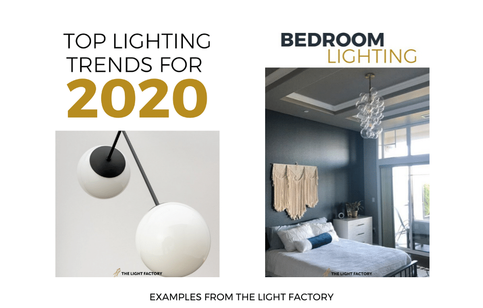
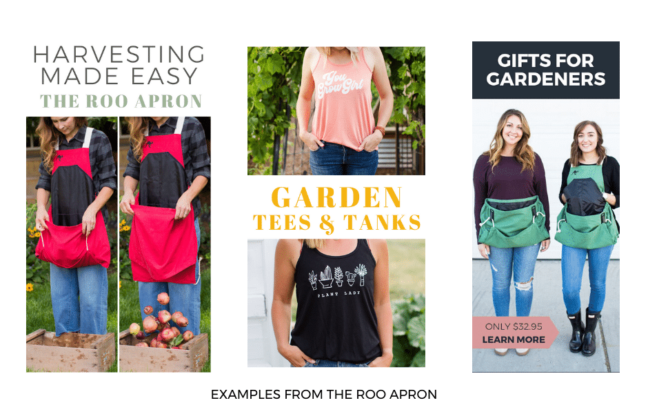
Keep it Vertical
This one is SO important! Because the platform scrolls up and down, vertical images perform best. They are more noticeable because they take up more real estate on the Pinterest feed, and they stay longer on the eyes due to their orientation. Longer images are attention-grabbing and consistently perform better than square or horizontal ones. Are most of your images landscape? No worries, you can crop them to be portrait or create a graphic that will allow you to add various sizes. If you regularly get photos taken, it’s something to mention to your photographer. Ask them to take several photos in the portrait shape.
Size Matters
If you make your vertical images too tall, there is the chance that they will get cropped in the feed. The best ratio is 1:1.5 (formally a 2:3 aspect ratio). As in, your image should be 1.5 times taller than it is wide. When it comes to pixels (px), Pinterest recommends images be 1000px wide and not to go less than 600px. So, essentially, the ideal images for Pinterest are 1000px wide and 1500px tall. Remembering this ratio can help your pins get noticed!
Be on Brand
You can have fantastic photography and correctly sized vertical images, but are your pins clearly communicating your brand? A user should be able to identify what the purpose of the image is quickly, and that purpose should also align with your brand and overall goals.
Text Overlays Are Your Best Friend
Text overlays are key! Please don’t write a book on your post, but having a catchy title is necessary to entice people to click through, especially for blog posts. Make the wording large enough so that it can be easily read on a smartphone as users are scrolling. Using font combinations (a family of fonts that go well together) can also be pleasing to the eye.
Design Well
A pin is a tiny ad that encourages people to head to your website, so it’s essential to treat it as such. Pins can be created so easily in Canva or Picmonkey for newbies or programs like Photoshop or Illustrator for those who are more advanced. Templates specifically designed for Pinterest, which include proportions, font combinations and color guides are in place on some of these design programs, which make it easier to create outstanding graphics like a pro.
Create Contrast
The best images pop. They use high contrast colors that make you take notice. I love to either use a light background with dark text, or dark background with light text. Ensure that your fonts are super readable and that the photo you use is not too busy. Again, we are trying to grab people’s attention and stand out from the crowd and the best way to do that is with strong contrast and image that pops! One way you can get ideas is by scrolling your feed and seeing what stands out to you!
Leave Your Mark
Your mark – whether it be your logo, web address, or both – should also be on the image. Please don’t make it the focal point, so make it subtle, but adding your mark to an image makes its origination clear.

By following the advice and guidelines above, you are well on your way to creating spectacular Pinterest images! You can also check out Pinterest’s guide here.
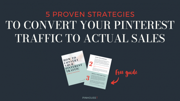
If you are wondering how to make that traffic convert into sales, be sure to grab my 5 Strategies For Converting Pinterest Traffic Free Guide!


Trackbacks/Pingbacks